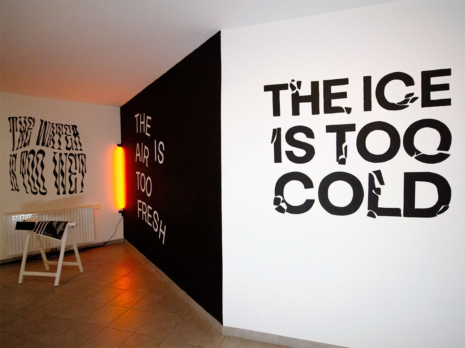
#thestruggleistooreal
Awareness Campaign
2020 @Graz, Austria
Concept & Design: Gloria Gietl, Maria Unterluggauer & Sarah Frühwirt
#thestruggleistooreal began as a poster series for The Change Club, a digital exhibition exploring climate change and the role design can play in raising awareness.
Working with Gloria Gietl and Maria Unterluggauer, I developed the concept, wrote copy and designed the posters and their applications across digital and physical formats. The project uses familiar-sounding complaints to draw attention to environmental conditions we often take for granted.
How can a poster series draw attention to climate change without relying on fear?

Turning complaints into a reason to look twice
APPROACH
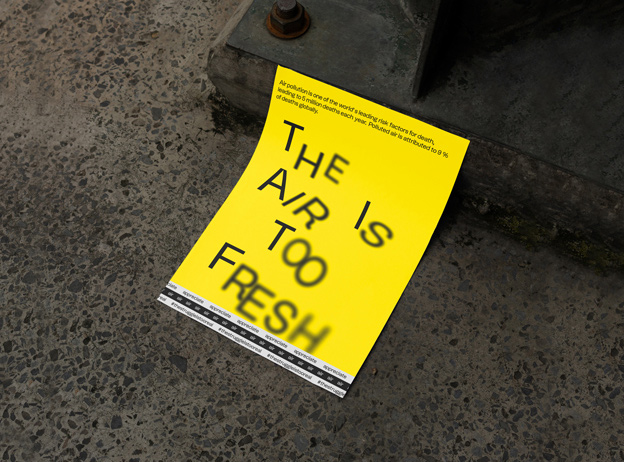
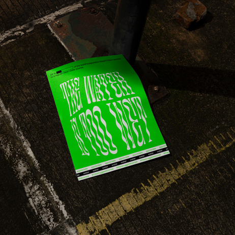
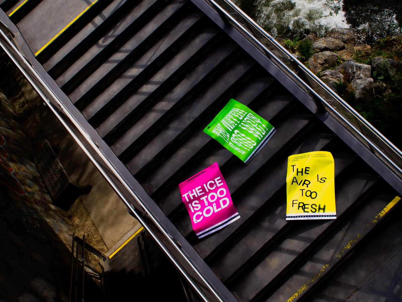
We used irony as the entry point. “The ice is too cold,” “The air is too fresh” and “The water is too wet” sound like problems at first. On a second look, they describe qualities worth protecting.
Each poster pairs its playful headline with a short fact that grounds the message in a real environmental issue. The headline invites curiosity; the supporting information gives that moment of attention a purpose.


One idea, three distinct voices
PROCESS
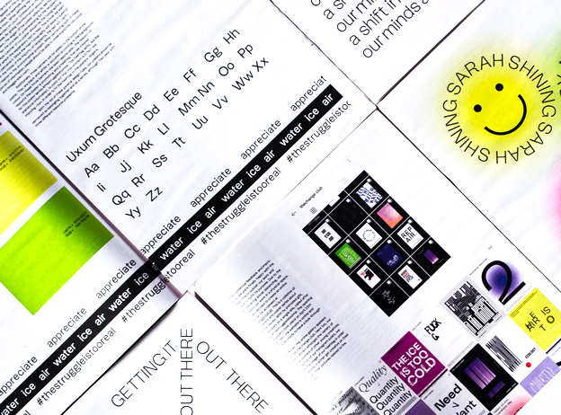
The posters needed to read as a series while giving each subject its own character. We kept a shared structure of headline, supporting fact and repeated “appreciate” strip, then shaped the typography around each message: fractured lettering for ice, blurred forms for air and flowing distortion for water.
Bright colour and large type made the statements quick to notice. We animated the posters for the digital exhibition and explored how the visual language worked in print. The project was also included in The Change Club’s publication.


From digital exhibition to public space
IMPACT
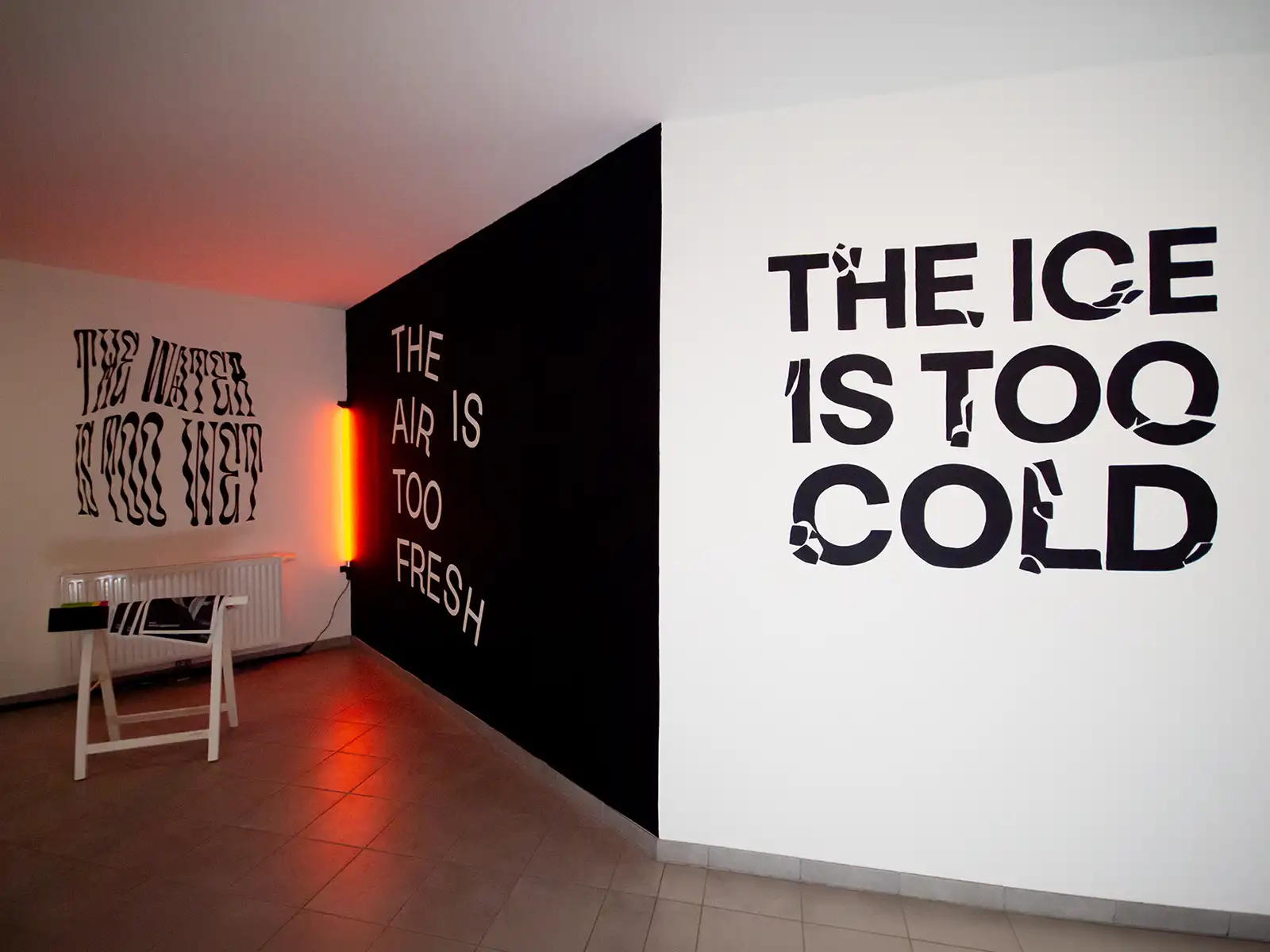
The series was shown at Zagreb Design Week 2020. For Urban Art Festival Styria 2020, the typographic idea was translated into a mural painted in a student residence in Graz.
Across the exhibition, printed work and mural, the messages remained recognisable while taking on a different presence at each scale. The project shows how a compact idea can grow beyond its original poster format.