FABRYK
E-Commerce Brand Development
2022 @Graz, Austria
Art Direction: Sarah Frühwirt
Web Design: Carina Rieder
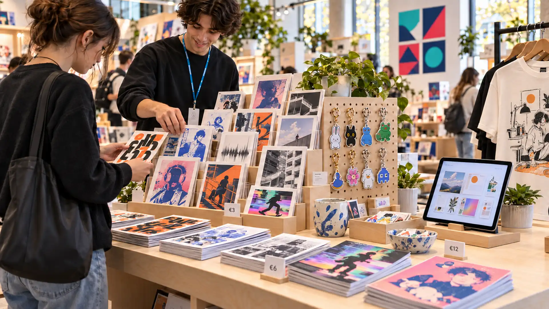
FABRYK is an online-shop concept for design students at FH JOANNEUM to showcase and sell their work, from prints and physical objects to templates, typefaces and digital assets.
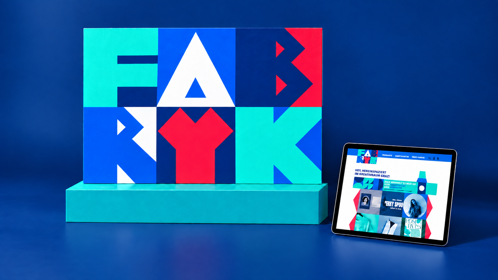
Developed as a collaborative master’s project with Carina Rieder, the work brought together our research and a brand strategy we developed jointly. I created the visual concept and brand identity, while Carina designed the website and user experience.
How can one recognisable brand bring together different products and creative voices while giving each designer’s work room to stand out?
Understanding the people behind the platform
APPROACH
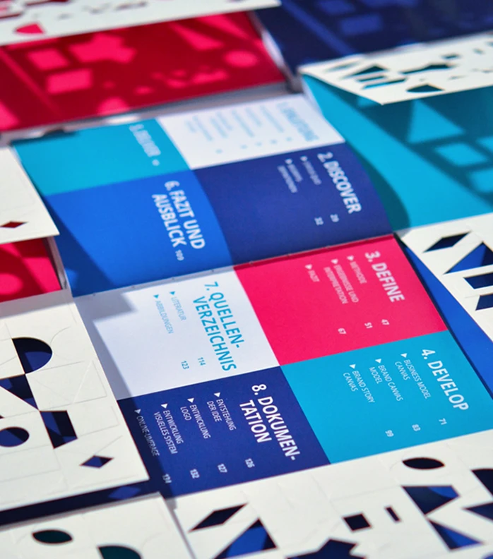
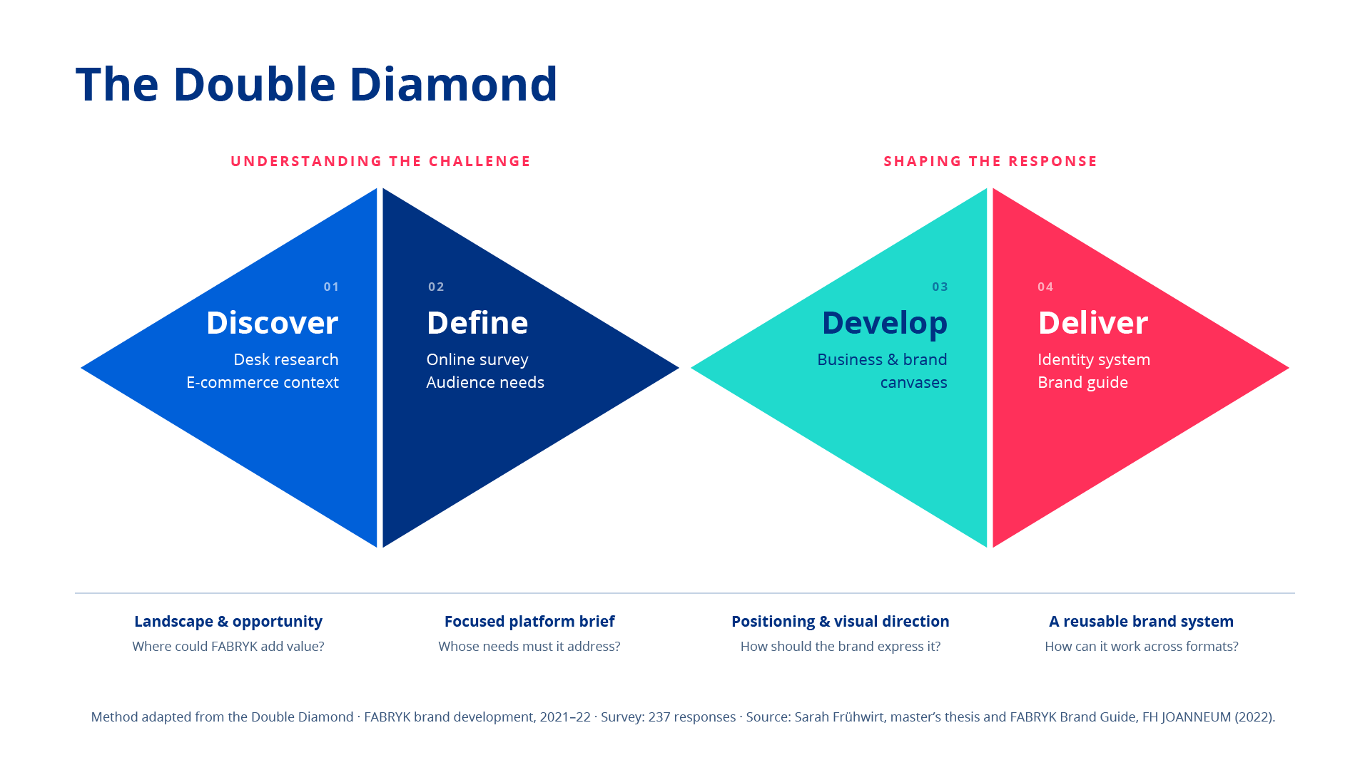
FABRYK needed to work for two audiences: students looking to share and sell their work, and customers interested in discovering emerging design. I explored their needs alongside the platform’s positioning and business model, using a Double Diamond approach to structure the process.
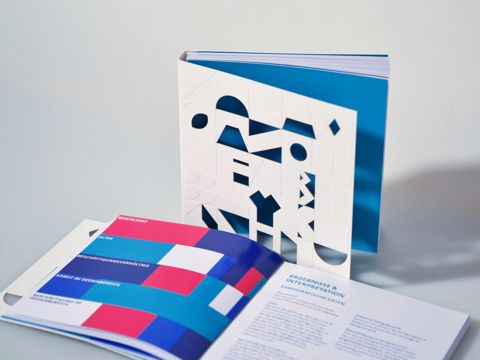
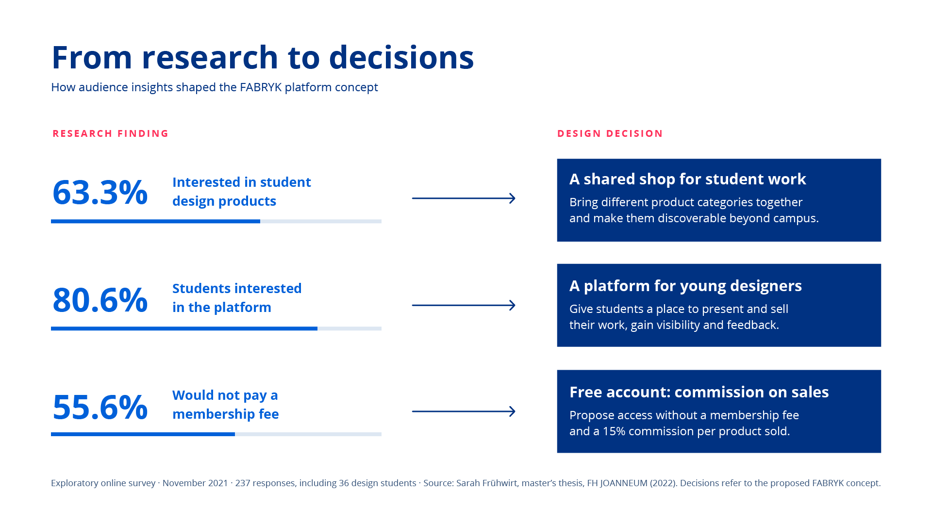
An exploratory online survey with 237 respondents, including 36 design students, helped inform the concept. Among all respondents, 63.3% were interested or very interested in student design products. The student responses highlighted opportunities to earn income, gain visibility and receive feedback. Their reluctance to pay a membership fee also informed the proposed model: free access with a commission on sales.
These findings helped position FABRYK as a platform for selling, experimenting and learning, rooted in the creative community of FH JOANNEUM.
Turning the factory concept into a flexible identity
PROCESS
The name combines “Fabrik”, the German word for factory, with the surname of institute head Mr. Fabry. It draws on the energy of a place where things are made, while celebrating experimentation and individual ideas.
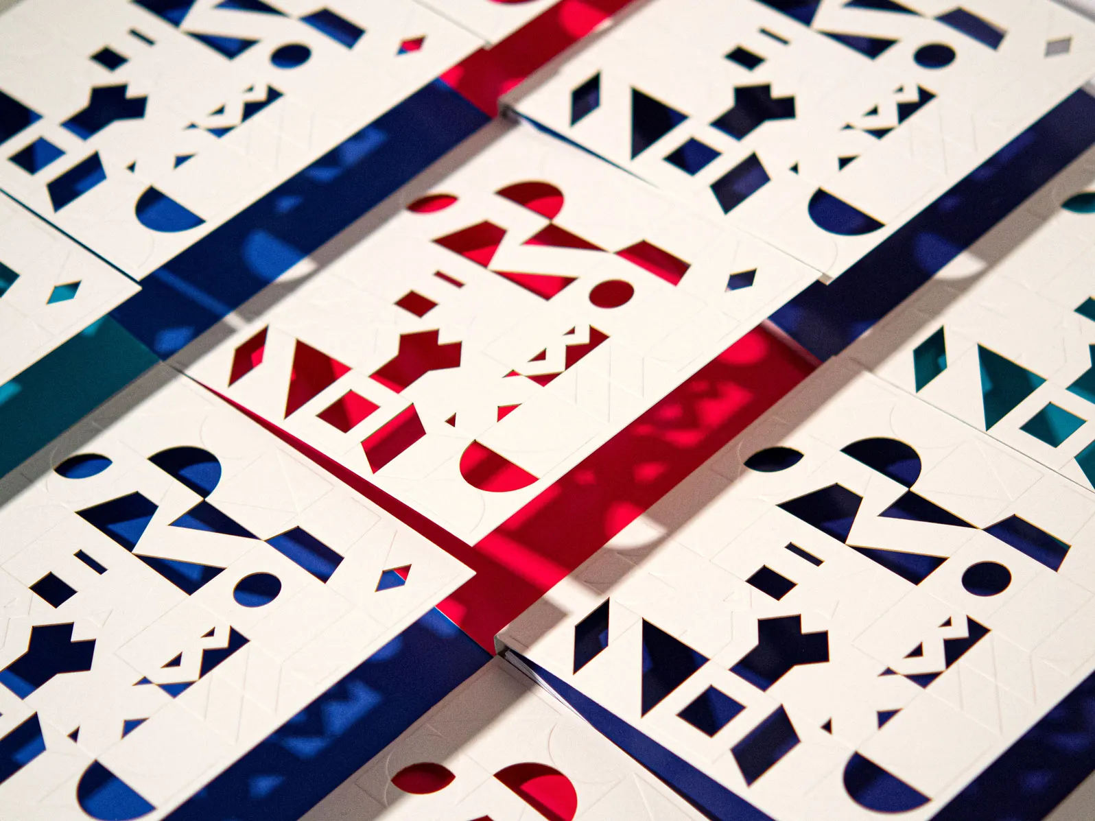
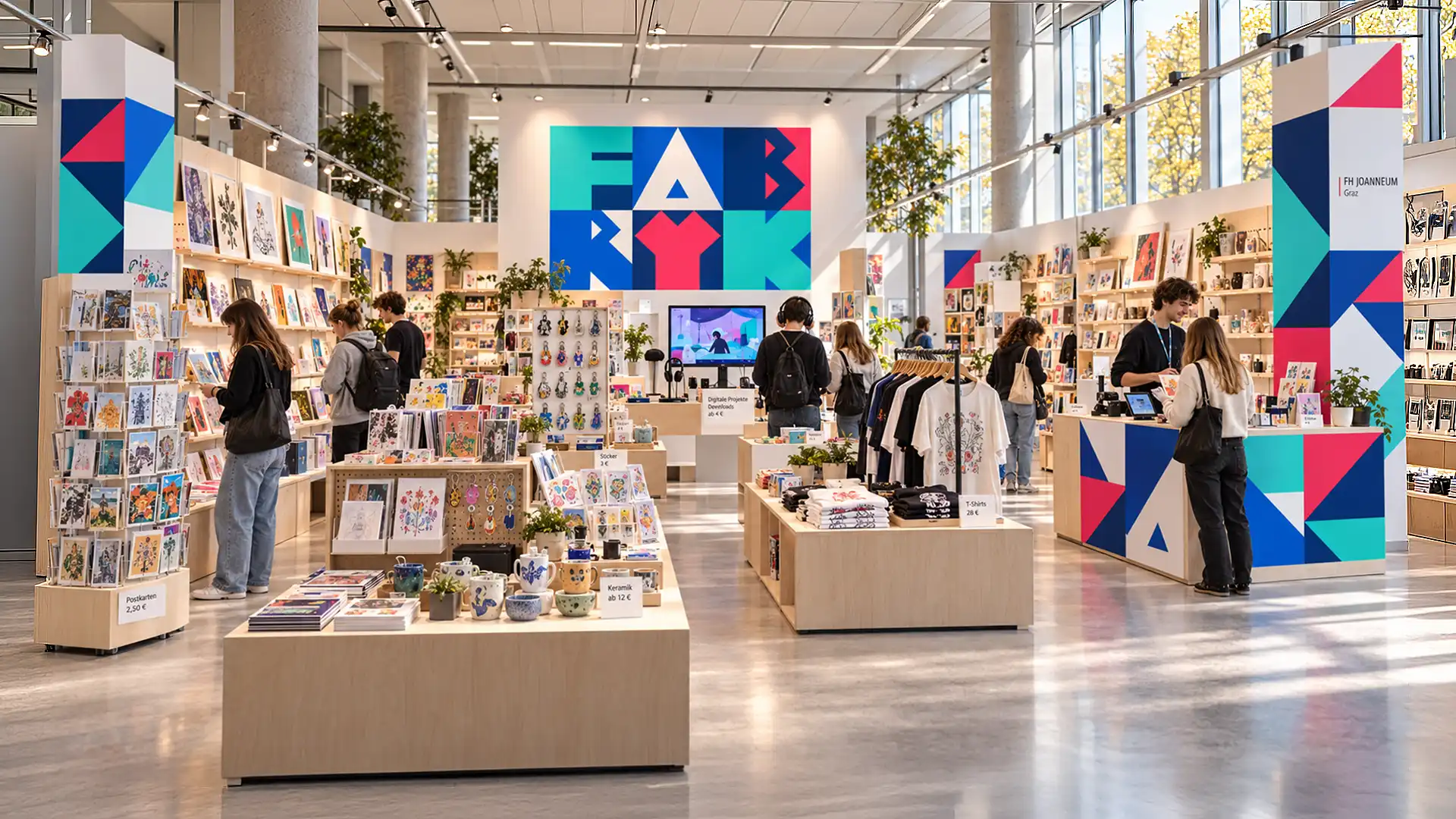
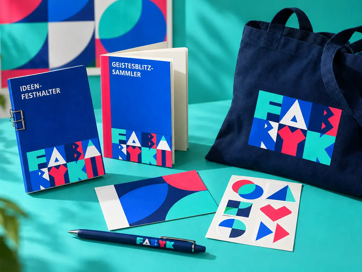
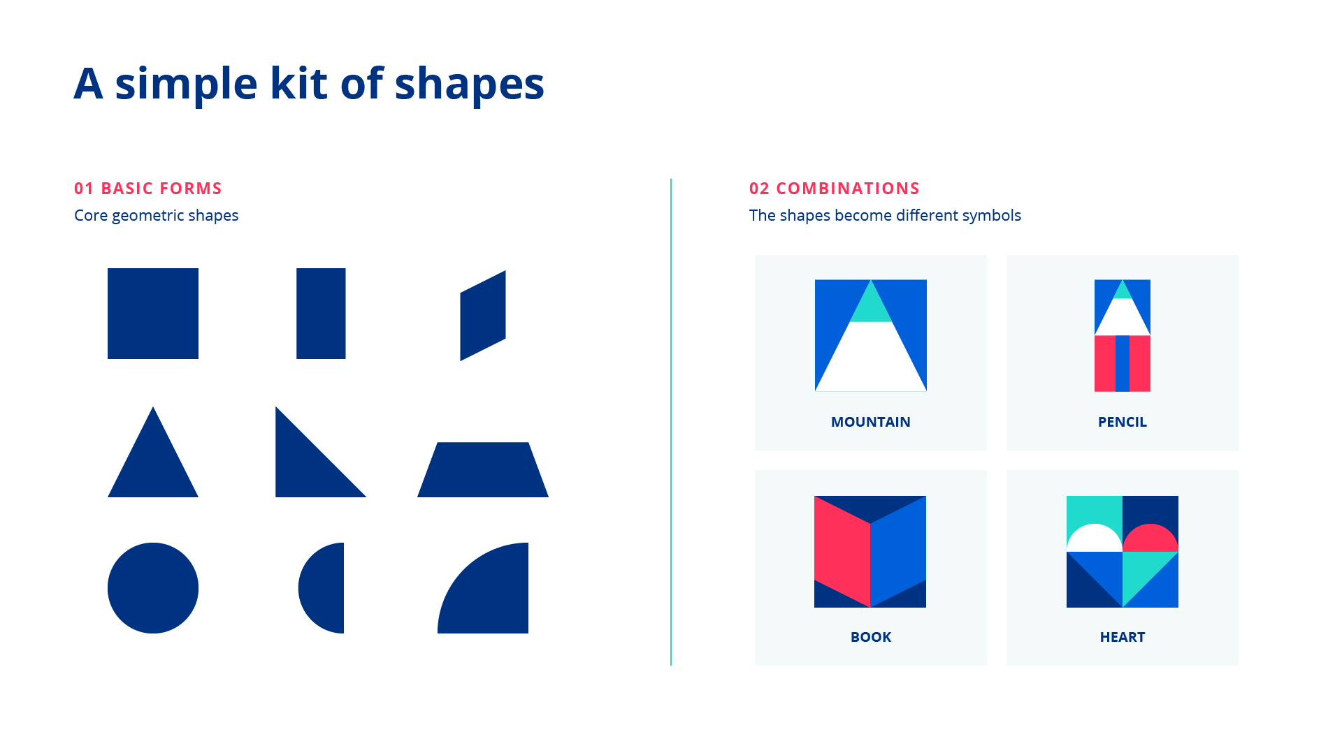
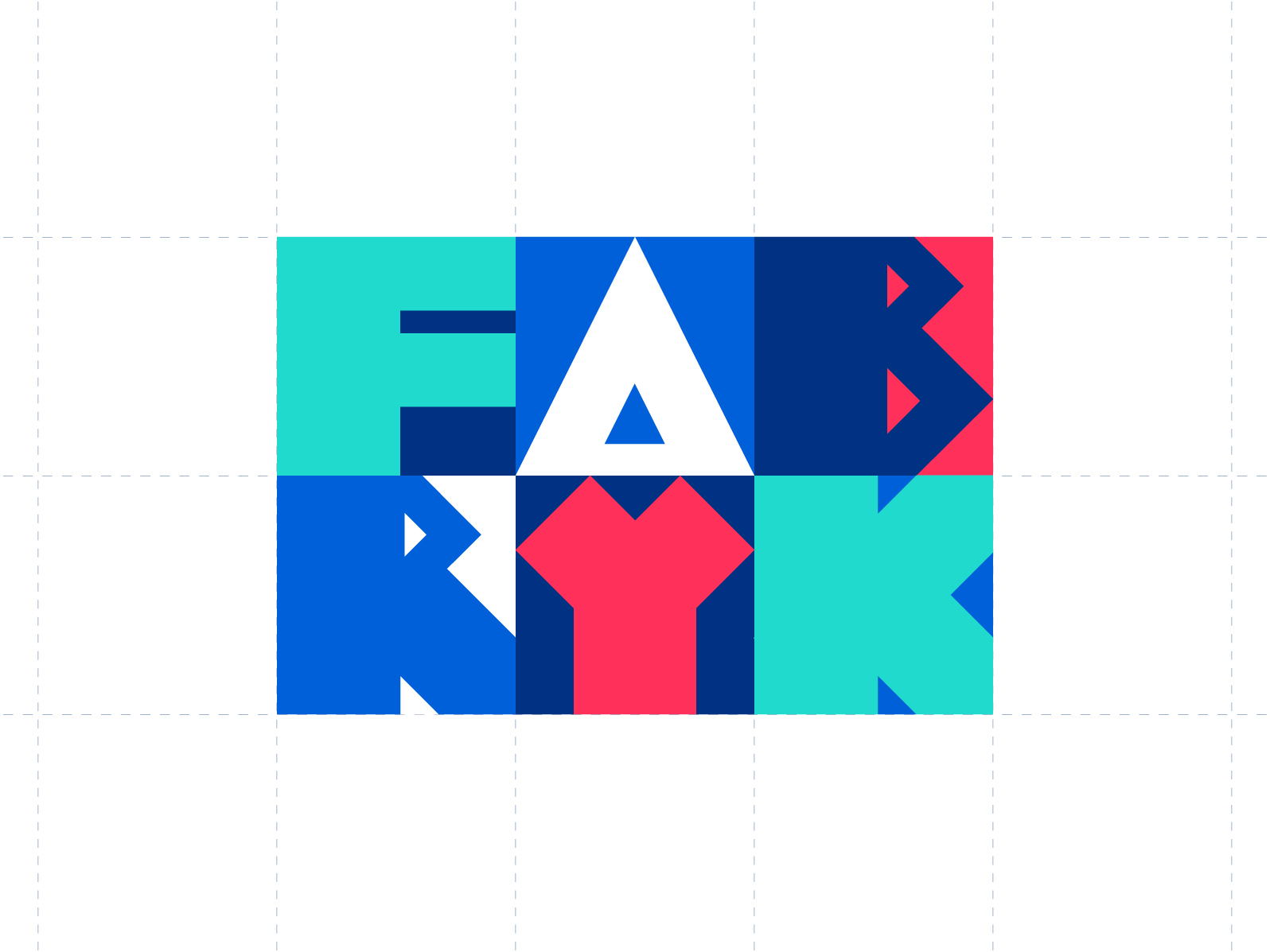
I translated this concept into a modular visual identity. Geometric shapes on a square grid form the logo, patterns and illustrations, allowing the brand to change across formats while remaining recognisable. Local references, including the Graz clock tower, connect the system to its origins.
I also created an animation that evokes the continuous activity of a factory: ideas are always being made, tested and developed. It gives the identity a sense of movement and presents FABRYK as an active space for student work.
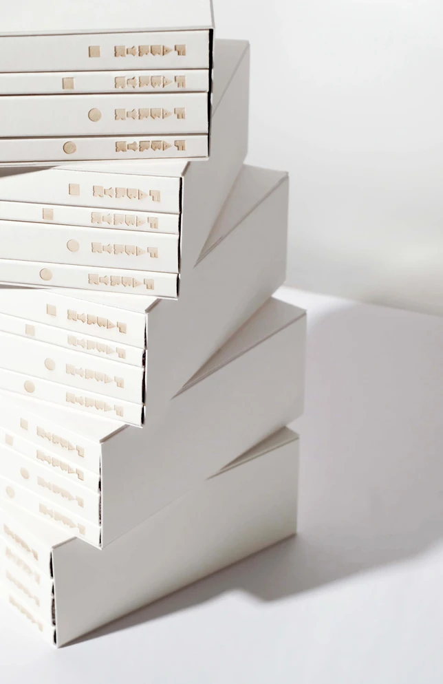
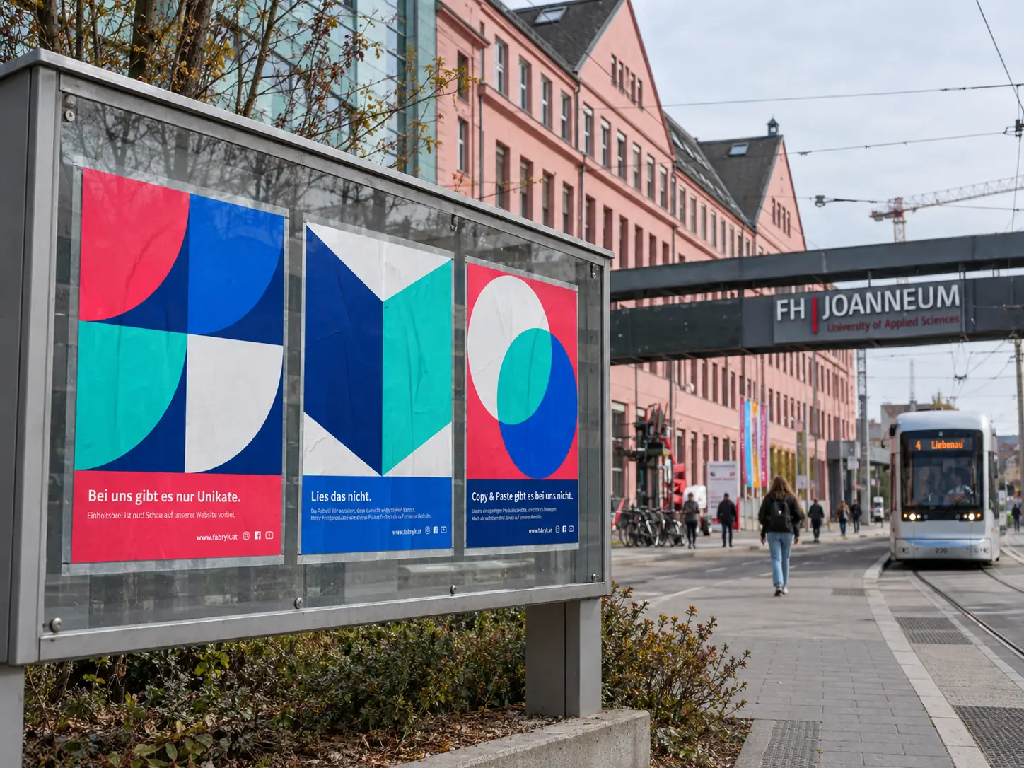
A defined colour palette, typography and photography guidelines bring consistency. The identity extends across digital communication, posters, packaging and merchandise, with each application balancing FABRYK’s presence with the products it presents.


A shared brand for different creative voices
IMPACT
The project resulted in a brand strategy, a flexible visual identity and a comprehensive brand guide, alongside the collaboratively developed online-shop concept. Together, they established a foundation for presenting physical and digital design products under one coherent brand.
FABRYK received a 2023 Red Dot Award in Brands & Communication Design. The shop remained a concept, with implementation dependent on further university support.
For this case study, I also created additional conceptual applications to explore how the brand could come to life across different products and touchpoints.